
During the Crucible alpha and beta process the studio research team conducted surveys that determined that there were improvements needed Based on this feedback during, we determined a plan-of-action for improving the User Interface (UI):
1
Players need to see a clear indication of when they're taking damage (and for how much)
2
There needs to be a way to see how much damage your character is doing
3
Reticles and HUD need better visibility/understandability
The following sections show designs for Crucible UI and UX improvement. Animated mock-ups were created using Adobe After Effects to allow the developer to implement the design. Polished UI assets were created by me using Adobe Illustator.
The following sections show designs for Crucible UI and UX improvement. Animated mock-ups were created using Adobe After Effects to allow the developer to implement the design. Polished UI assets were created by me using Adobe Illustator.
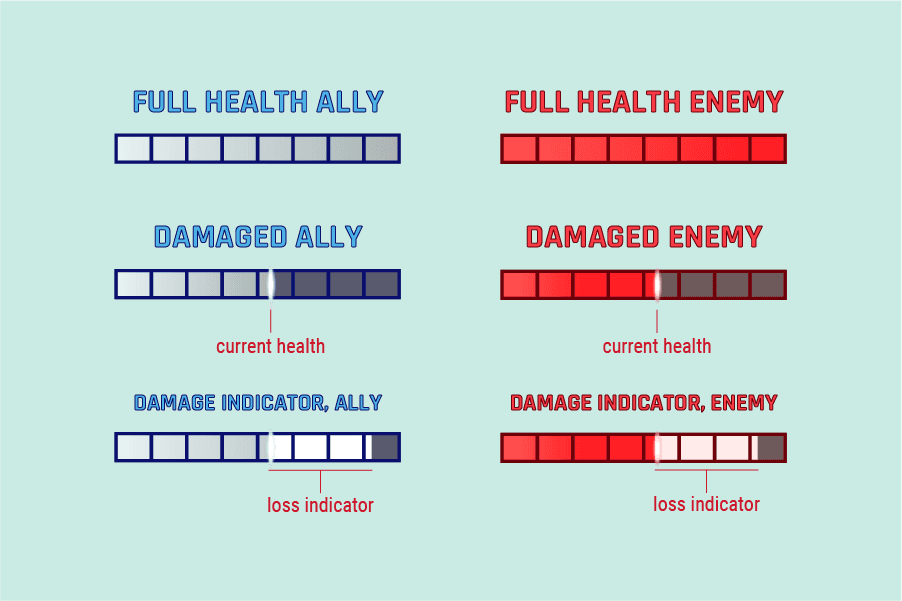
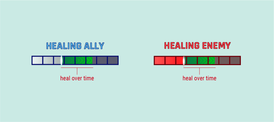
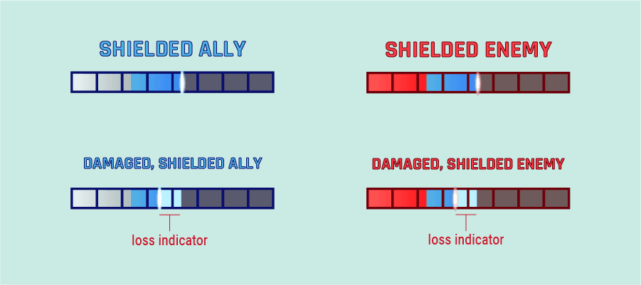
Damage over time (DOT) values were not clearly indicated on healthbars, and players had trouble understanding how much damage they were taking. The new design segments DOT damage being so that a player could better see how dangerous the damage was.

The top UI asset is a mock-up for the new DOT indication
Floating Damage Numbers
The first release of Crucible did not include indicators that showed how much damage a character was doing. The overwhelming feedback from our players that they wanted to see number indicators for damage.
Adding numbers would enforce feedback that players were hitting their targets, as well as help show the progression of there characters as they gained strength over the course of a match.
Mock-up for normal and critical damage numbers
Example of collated numbers that appeared when damage occurred quickly
Mock-up for Damage Over Time (DOT)
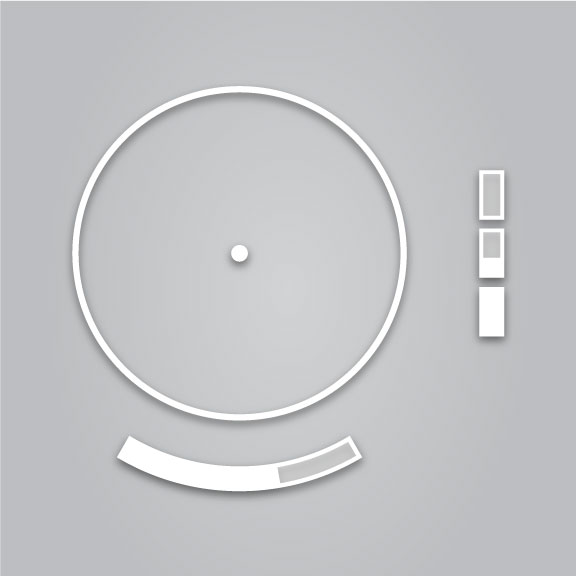
Reticle UI Designs
After Crucible alpha test, we identified that it was necessary to improve the reticle UI for the characters "Earl" and "Kirri". The reason for the required redesign was that initial implementation was incomplete or not able to be understood by players.

Reticle and UI redesign for "Earl"
New reticle design for "Earl" completed and in game

Reticle and UI redesign for "Kirri"
New reticle design for "Earl" completed and in game
Unfortunately, Crucible was cancelled shortly after launch. Full research data was never gathered to validate the success of these UI/UX changes. Our players were appreciative of these changes and there is anecdotal evidence that the designs were working according to word-of-mouth from our community in the Discord community.
A lot was learned through the course of these redesigns, and I am thankful that I got to work with such an amazing group of designers, engineers, and artists.
